CSS 滾動驅動動畫實現圓弧滾動條

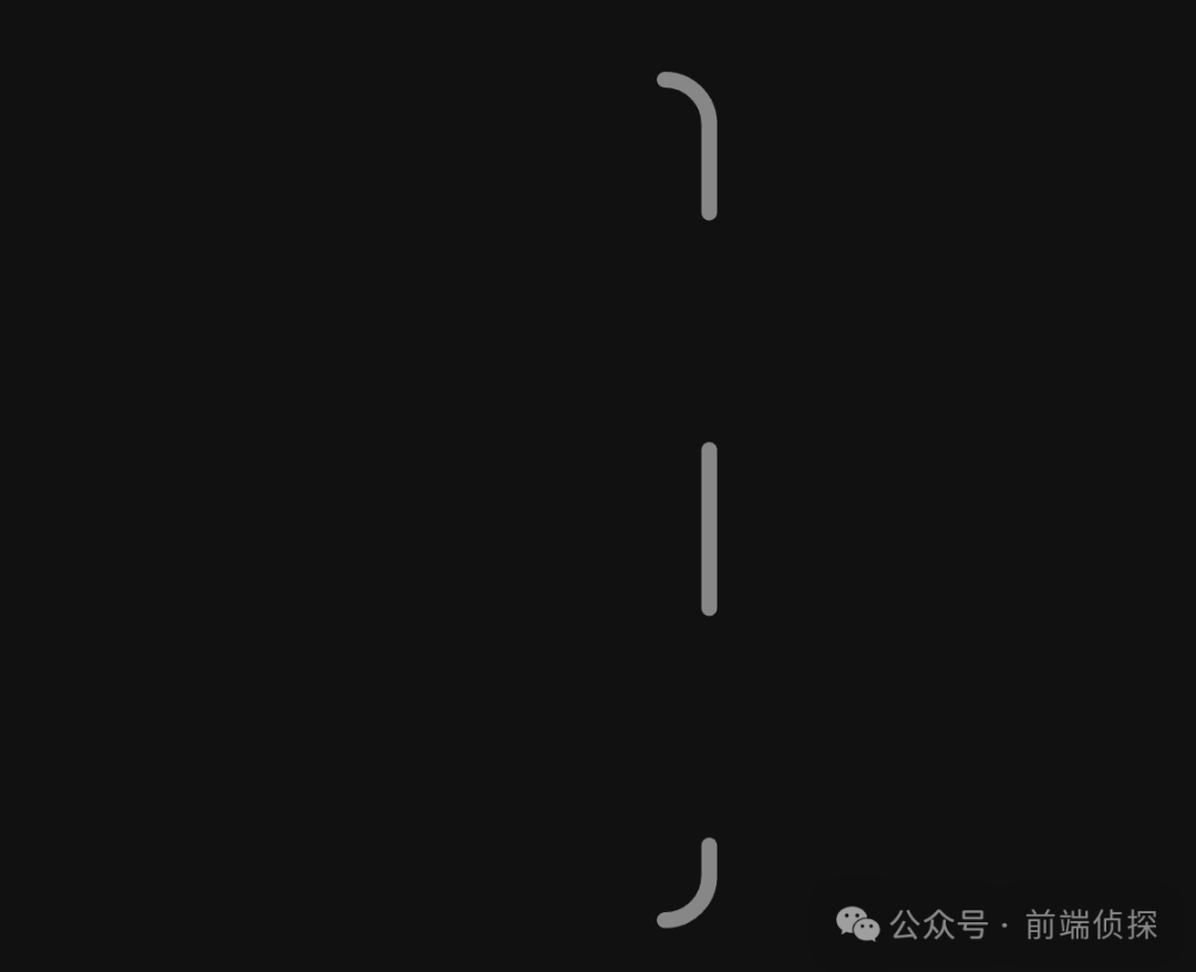
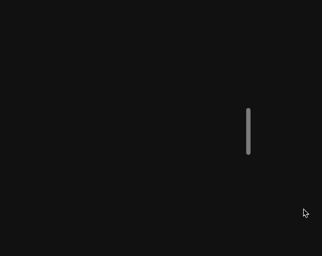
前不久看到這樣一個很有趣的效果,它的滾動條是沿著圓角邊緣滾動的,效果如下
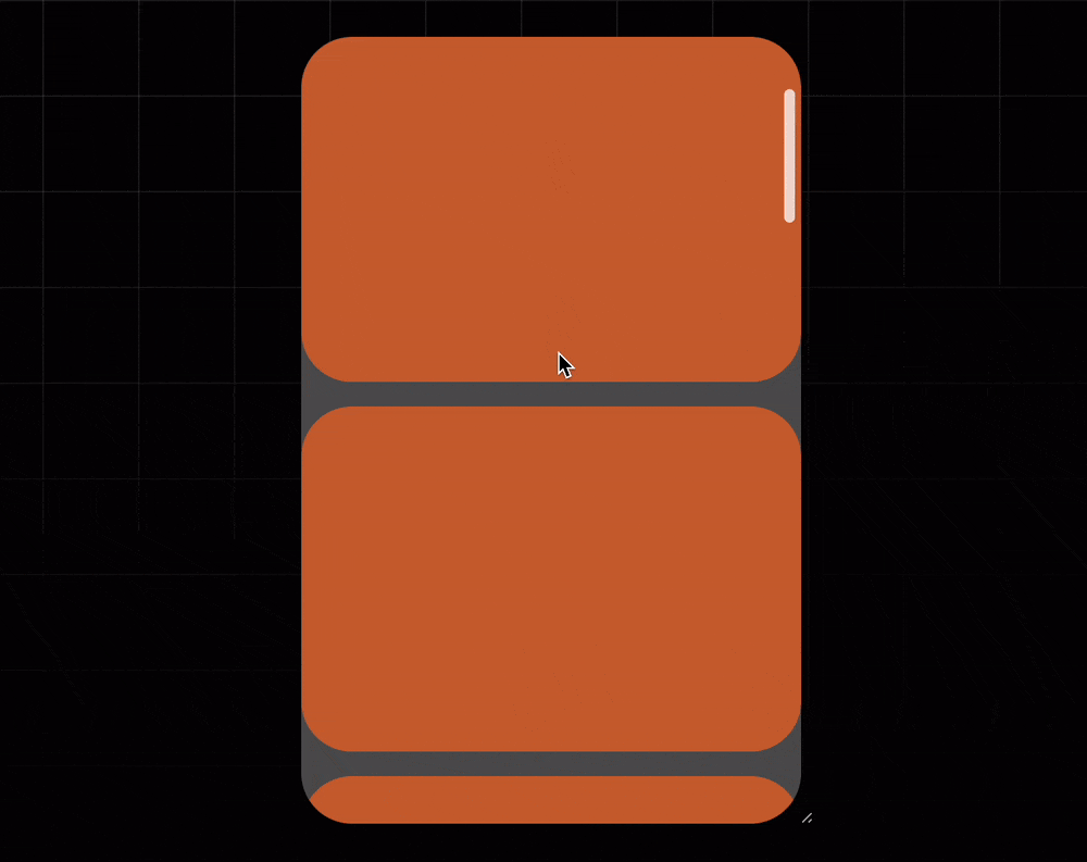
你可以查看原鏈接來體驗一下
https://codepen.io/jh3y/pen/gOEgxbd。
這是如何實現的呢?
原效果中由于為了兼容不支持CSS滾動驅動的瀏覽器,特意用 JS做了兼容,所以看著比較復雜,其實核心非常簡單,下面我將用最簡短的 CSS 來復刻這一效果,一起看看吧!

一、SVG 路徑動畫
從本質上來講,其實是一個 SVG 路徑動畫。
具體如何實現呢?
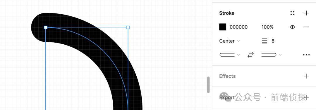
首先,我們通過設計軟件繪制一個這樣的路徑。
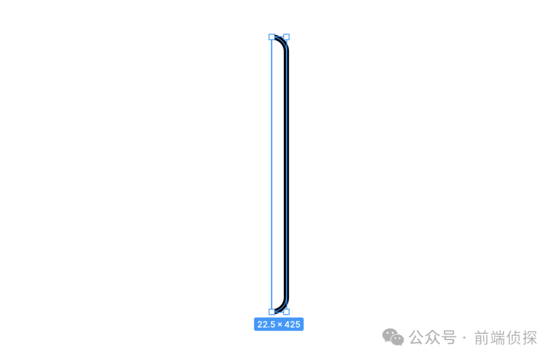
注意設置描邊的大小還有端點的類型,比如下面是round效果。
然后導出SVG,可以得到這樣一段代碼。
<svg viewBox="0 0 31 433" fill="none" xmlns="http://www.w3.org/2000/svg">
  <path d="M4 4C9.96737 4 15.6903 6.37053 19.9099 10.5901C24.1295 14.8097 26.5 20.5326 26.5 26.5V406.5C26.5 412.467 24.1295 418.19 19.9099 422.41C15.6903 426.629 9.96737 429 4 429" stroke="black" stroke-width="8" stroke-linecap="round" stroke-linejoin="round"/>
</svg>
然后,如何讓這段SVG動起來呢?
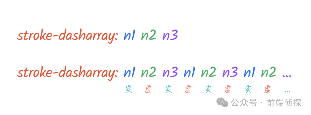
很簡單,現在SVG是一段實線,我們可以通過stroke-dasharray設置成虛線,比如:
path{
  stroke-dasharray: 80
}
這樣會得到一個實線和虛線間隔都是80的虛線。
如果希望虛線空白的地方更大一點,該怎么設置呢?很簡單,繼續往后加。
path{
  stroke-dasharray: 80 120
}
效果如下:
所以,這種寫法其實相當于把當前的值無限重復,示意如下:
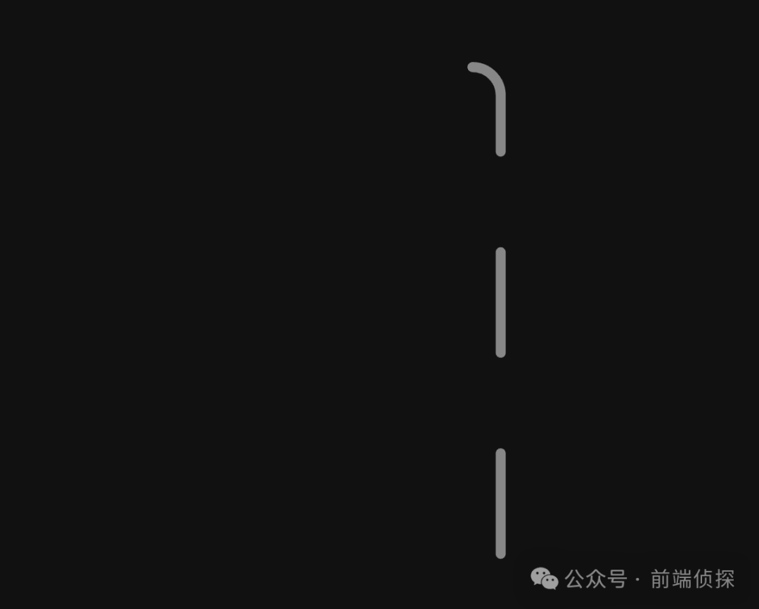
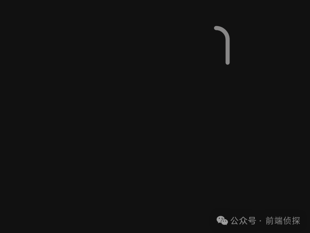
當然,我們這里不需要設置的這么復雜,只需要一小段實線就夠了,所以是實現加上一段足夠長的虛線(超過路徑本身就行),實現如下:
path{
  stroke-dasharray: 80 1000
}
這樣就得到了一小段實線。
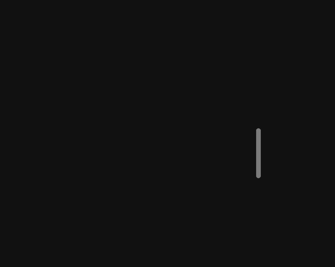
那么,如何讓他動起來呢?很簡單,改變一下偏移就可以,這個可以用stroke-dashoffset來實現。
比如:
@keyframes scroll {
  to {
    stroke-dashoffset: -370
	}
}
path{
  stroke-dasharray: 80 1000;
  animation: scroll 3s alternate-reverse infinite;
}
效果如下:
是不是有點像呢?
我們再調整一下起始偏移量,讓它出去一點。
@keyframes scroll {
  0% { stroke-dashoffset: 75; }
  100% { stroke-dashoffset: -445; }
}
這樣就更接近我們想要的效果了。
整個運動原理就是這樣了,接著往下看
二、CSS 滾動驅動動畫
接下來需要通過滾動驅動動畫將容器滾動與CSS動畫「聯動」起來。
簡單來講,「CSS 滾動驅動動畫」指的是將「動畫的執行過程由頁面滾動」進行接管,也就是這種情況下,「動畫只會跟隨頁面滾動的變化而變化」,也就是滾動多少,動畫就執行多少,「時間不再起作用」。
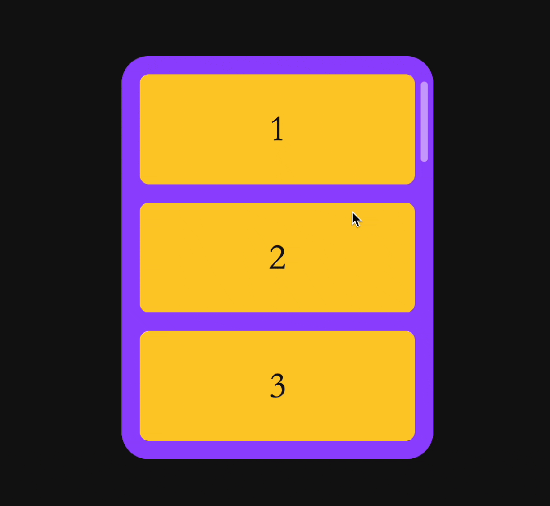
先簡單布局一下:
<div class="list">
  <div class="item" id="item_1">1</div>
  <div class="item" id="item_2">2</div>
  <div class="item" id="item_3">3</div>
  <div class="item" id="item_4">4</div>
  <div class="item" id="item_5">5</div>
  <div class="item" id="item_6">6</div>
  <div class="item" id="item_7">7</div>
</div>
美化一下:
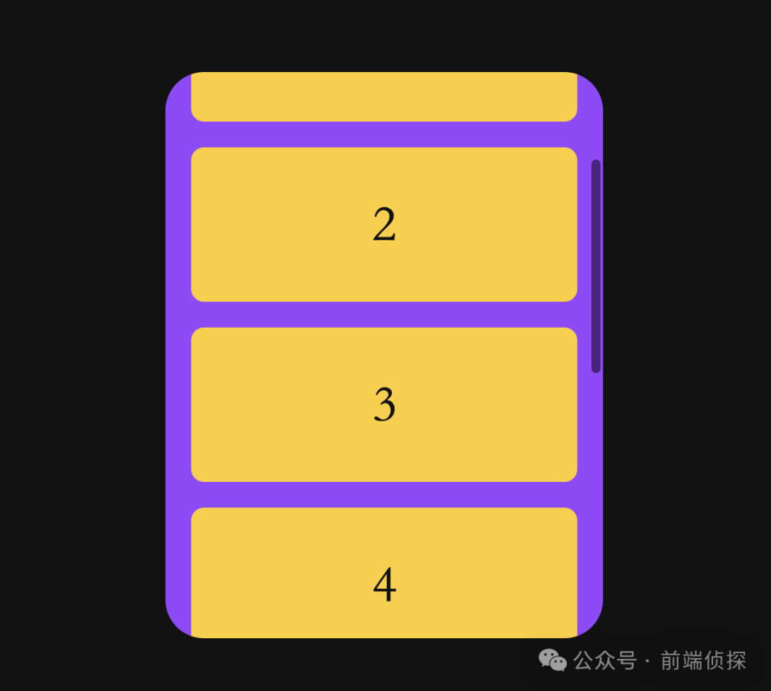
然后,我們將默認的滾動條隱藏,用我們這個 SVG路徑來代替,由于需要絕對定位,我們再套一層父級。
<div class="wrap">
  <div class="list">
    <div class="item" id="item_1">1</div>
    <div class="item" id="item_2">2</div>
    <div class="item" id="item_3">3</div>
    <div class="item" id="item_4">4</div>
    <div class="item" id="item_5">5</div>
    <div class="item" id="item_6">6</div>
    <div class="item" id="item_7">7</div>
    <!--滾動條-->
    <svg class="scroller" viewBox="0 0 31 433" fill="none" xmlns="http://www.w3.org/2000/svg">
      <path class="scroller_thumb" d="M4 4C9.96737 4 15.6903 6.37053 19.9099 10.5901C24.1295 14.8097 26.5 20.5326 26.5 26.5V406.5C26.5 412.467 24.1295 418.19 19.9099 422.41C15.6903 426.629 9.96737 429 4 429" stroke="black" stroke-width="8" stroke-linecap="round" stroke-linejoin="round"/>
    </svg>
  </div>
</div>
相關CSS如下:
.wrap{
  position: relative;
}
.scroller {
  position: absolute;
  top: 0;
  bottom: 0;
  right: 0;
  pointer-events: none;
  height: -webkit-fill-available;
  margin: 5px;
}
.scroller_thumb{
  stroke: hsl(0 0% 100% / 0.5);
  stroke-dasharray: 80 450;
  stroke-width: 8px;
  animation: scroll both 5s linear;
}
這樣結構就搭好了,只是滾動條會自動播放。
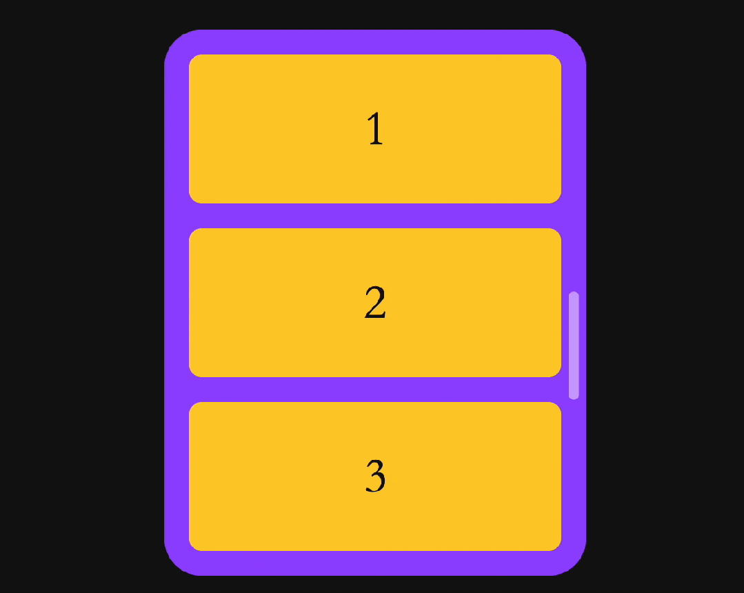
接下來就是最關鍵的一步,加上滾動驅動動畫。
.scroller_thumb{
  animation: scroll both 5s linear;
  animation-timeline: scroll();
}
但是這樣是不起作用的,直接使用scroll()會自動尋找它的相對父級,也就是.wrap,但實際滾動的其實是.list,所以這種情況下我們需要具名的滾動時間線,實現如下:
.list{
  scroll-timeline: --scroller;
}
.scroller_thumb{
  animation: scroll both 5s linear;
  animation-timeline: --scroller;
}
這樣SVG路徑動畫就能跟隨容器滾動而運動了。
三、CSS 滾動吸附
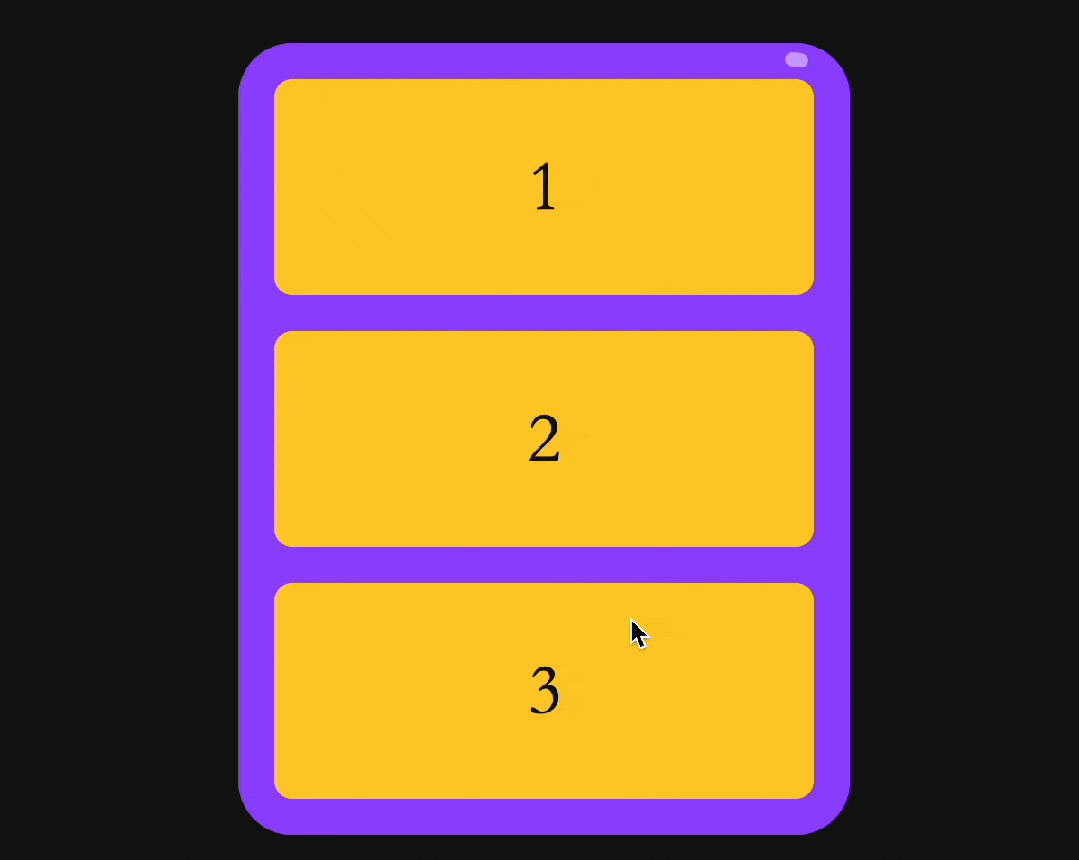
原效果中還有一個滾動回彈的效果,當滾動到容器邊緣時,會自動回彈到起始位置。
其實只需要用到 CSS scroll snap 就可以了。
https://developer.mozilla.org/zh-CN/docs/Web/CSS/scroll-snap-type。
實現很簡單,給滾動容器添加scroll-snap-type屬性,表示這是個允許滾動吸附的容器。
.list{
scroll-snap-type: y mandatory;
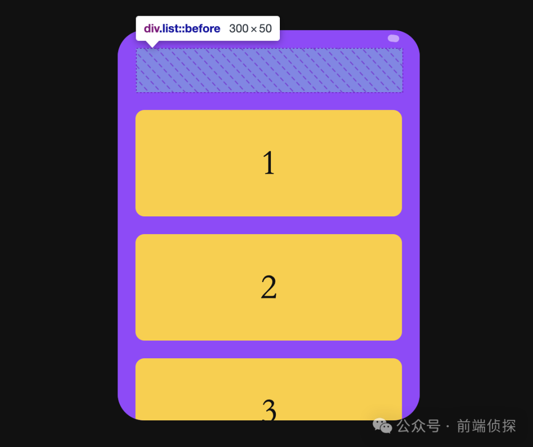
}然后就指定需要吸附的點了,由于需要回彈的效果,所以滾動容器的首尾需要一個空白的容器,這里直接用兩個偽元素來生成
.list::before,
.list::after{
  content: '';
  height: 50px;
  flex-shrink: 0;
}
效果如下:
然后我們設置滾動吸附點就行了,設置第一個元素頂部和最后一個元素底部,其他元素居中就行了。
.item{
  scroll-snap-align: center;
}
.item:first-child{
  scroll-snap-align: start;
}
/*最后一個元素是 SVG,所以這里用倒數第二個元素*/
.item:nth-last-child(2){
  scroll-snap-align: end;
}
這樣就實現了文章開頭的效果了。
完整代碼可以查看以下鏈接(無任何 JS)
- CSS round scroll (juejin.cn)[1]
- CSS round scroll (codepen.io)[2]
四、總結一下
總的來說,CSS滾動驅動在滾動交互上帶來了無限可能,很多以前必須借助 JS來實現的都可以輕易實現,下面總結一下。
- 從本質上來講,右側的滾動條其實是一個 SVG 路徑動畫。
- SVG路徑可以通過stroke-dasharray設置虛實間隔。
- 當虛線間隔足夠長時,超過路徑本身,就能得到一小塊實線。
- 通過改變stroke-dashoffset偏移能夠實現路徑描邊動畫。
- 借助 CSS滾動驅動動畫可以將SVG路徑動畫跟隨容器滾動而運動。
- 滾動回彈效果其實就是CSS scroll snap實現的。
[1]CSS round scroll (juejin.cn): https://code.juejin.cn/pen/7326425332964130856。
[2]CSS round scroll (codepen.io): https://codepen.io/xboxyan/pen/WNmjZLo。