Python也太好用了吧!一個plotly庫就能實現(xiàn)交互式數(shù)據(jù)可視化
在本文中,我們將學習如何在Python中創(chuàng)建交互式可視化。我們將從僅僅以不同格式繪制數(shù)據(jù)開始,然后再探索添加更多交互式控件。
今天,我們將學習如何使用Plotly express。Plotly允許用戶在肉眼可見的可視化界面上進行數(shù)據(jù)交互,并且與Web內(nèi)容集成起來要容易得多。
plotly express簡介
plotly express是 plotly 包裝器,它允許使用更簡單的語法。
受Seaborn和ggplot2的啟發(fā),它經(jīng)過專門設計,具有簡潔、一致且易于學習的API:只需一次導入,你就可以在一個函數(shù)調(diào)用中創(chuàng)建豐富的交互式圖,包括刻面、地圖、動畫和趨勢線。
如果你想了解更多信息,可訪問Plotly的官方文檔:
https://medium.com/plotly/introducing-plotly-express-808df010143d
只需要兩行代碼,你就可以擁有一個漂亮的交互式圖表,非常簡單:
- import plotly.express as px
- fig = px.line(x='x data set', y= 'y data set')
- fig.show()
數(shù)據(jù)來源及準備
在本文中,我們將使用COVID-19數(shù)據(jù)集。
我們將使用以下代碼來獲取和格式化數(shù)據(jù):
- import plotly.express as px
- import numpy as np
- import pandas as pd
- url = 'https://raw.githubusercontent.com/CSSEGISandData/COVID-19/master/csse_covid_19_data/csse_covid_19_time_series/time_series_covid19_deaths_global.csv'
- df = pd.read_csv(url, delimiter=',', header='infer')
- df_interest = df.loc[
- df['Country/Region'].isin(['United Kingdom', 'US', 'Italy', 'Brazil', 'India'])
- & df['Province/State'].isna()]
- df_interest.rename(
- index=lambda x: df_interest.at[x, 'Country/Region'], inplace=True)
- df1 = df_interest.transpose()
- df1 = df1.drop(['Province/State', 'Country/Region', 'Lat', 'Long'])
- df1 = df1.loc[(df1 != 0).any(1)]
- df1.index = pd.to_datetime(df1.index)
- df1 = df1.diff() #數(shù)據(jù)每日變化
創(chuàng)建圖表
1、線圖
要在圖形上添加一個國家的疫情數(shù)據(jù)可視化,我們只需要兩行代碼:
- fig = px.line(x=df1.index, y= df1[df1.columns[0]],title = 'Daily Deaths due to COVID-19', name = df1.columns[0])
- fig.show()
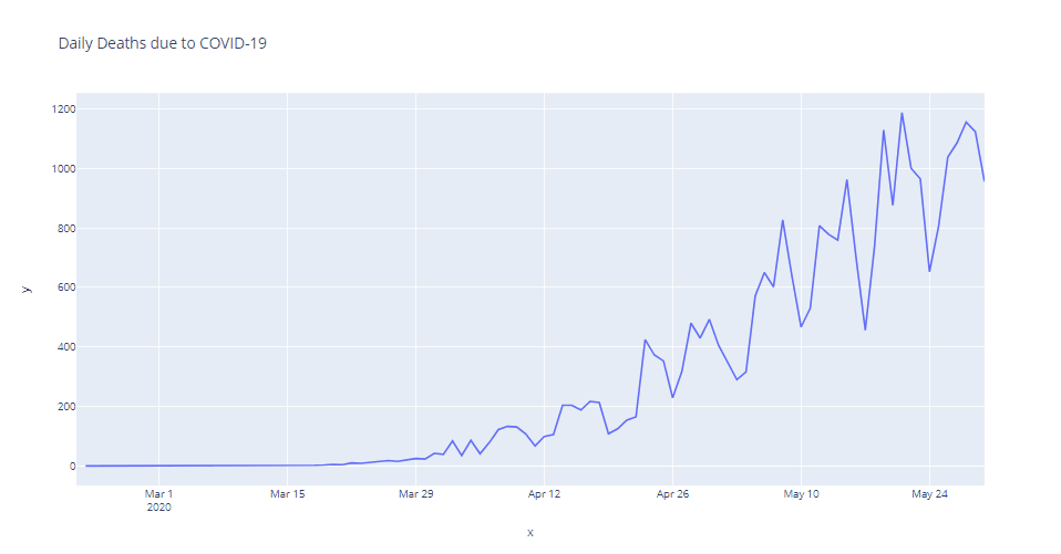
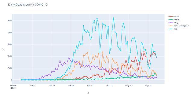
單線圖
要添加更多國家的數(shù)據(jù),我們需要.add_scatter()屬性。通過使用循環(huán),我們可以添加所有范圍內(nèi)的國家。
- fig = px.line()
- for i,n in enumerate(df1.columns):
- fig.add_scatter(x=df1.index, y= df1[df1.columns[i]], name= df1.columns[i])
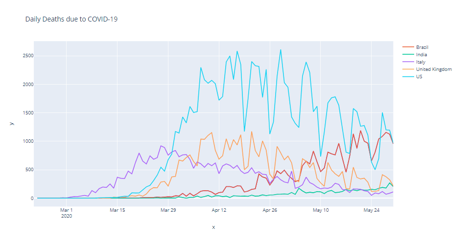
多線圖
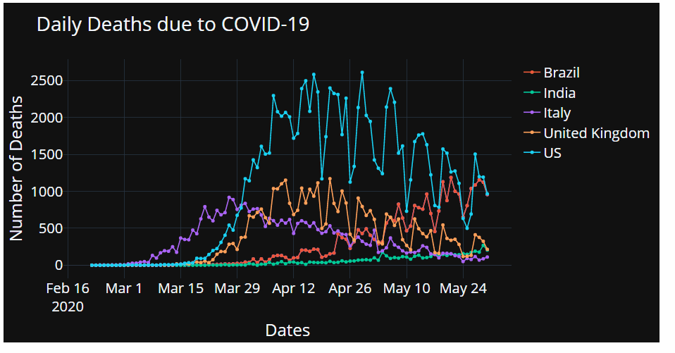
最后,我們可以考慮在圖中添加更多的細節(jié),個人喜歡在圖中突出顯示不同的數(shù)據(jù)點。
- fig.update_traces(mode='markers+lines')
帶標記的圖形
最后,添加相關(guān)的軸標簽,設置字體大小并替換默認模板。
- fig.update_layout(
- title = 'Daily Deaths due to COVID-19'
- ,xaxis_title = 'Dates'
- ,yaxis_title = 'Number of Deaths'
- ,font = dict(size = 25)
- ,template = 'plotly_dark' #"plotly", "plotly_white", "plotly_dark", "ggplot2", "seaborn", "simple_white", "none"
- )
2、條形圖
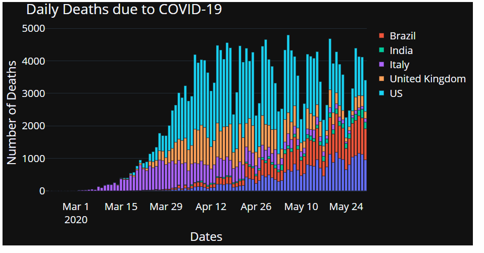
正如我們之前看到的,條形圖可以很快就可以組合起來:
- fig = px.bar(x=df1.index, y= df1[df1.columns[0]])
- for i,n in enumerate(df1.columns):
- fig.add_bar(x=df1.index, y= df1[df1.columns[i]], name= df1.columns[i])
- fig.update_layout(
- title = 'Daily Deaths due to COVID-19'
- ,xaxis_title = 'Dates'
- ,yaxis_title = 'Number of Deaths'
- ,font = dict(size = 25)
- ,template = 'plotly_dark' #"plotly", "plotly_white", "plotly_dark", "ggplot2", "seaborn", "simple_white", "none"
- )
- fig.show()
3、餅狀圖
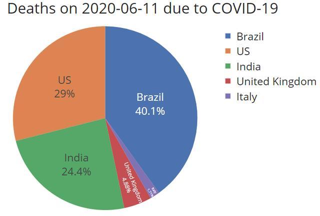
和以前一樣,唯一的區(qū)別是我們只顯示時間序列中的最新一天。
- df1 = df1.tail(1).transpose()
- fig = px.pie(df1, values = str(df1.columns[0]), names = df1.index)
- fig.update_traces(textposition='inside', textinfo = 'percent+label')
- ddate = str(df1.columns[0])[:10] #時間戳
- fig.update_layout(
- title = f'Deaths on {ddate} due to COVID-19'
- ,xaxis_title = 'Dates'
- ,yaxis_title = 'Number of Deaths'
- ,font = dict(size = 25)
- ,template = 'seaborn' #"plotly", "plotly_white", "plotly_dark", "ggplot2", "seaborn", "simple_white", "none"
- )
- fig.show()
交互控件
通過上文,我們知道了如何快速地將不同類型的可視化組合在一起,接下來我們用交互控件來增強數(shù)據(jù)的可視化。
1、范圍滑塊
首先,通過下面的一行代碼來添加一個范圍滑塊,這是一個很好用的控件,讓用戶看到自己控制想看的特定部分。
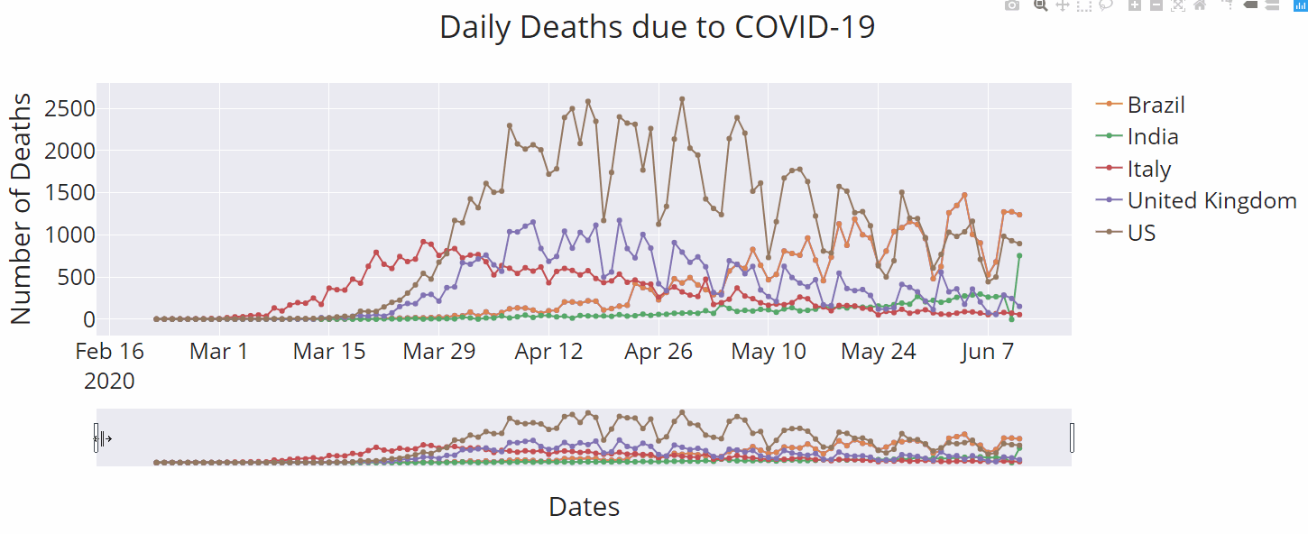
- fig.update_xaxes(rangeslider_visible=True)
2、范圍焦點
如果我們的用戶只想關(guān)注某個時間段里的某些部分呢?我們可以直接建立這些控件!
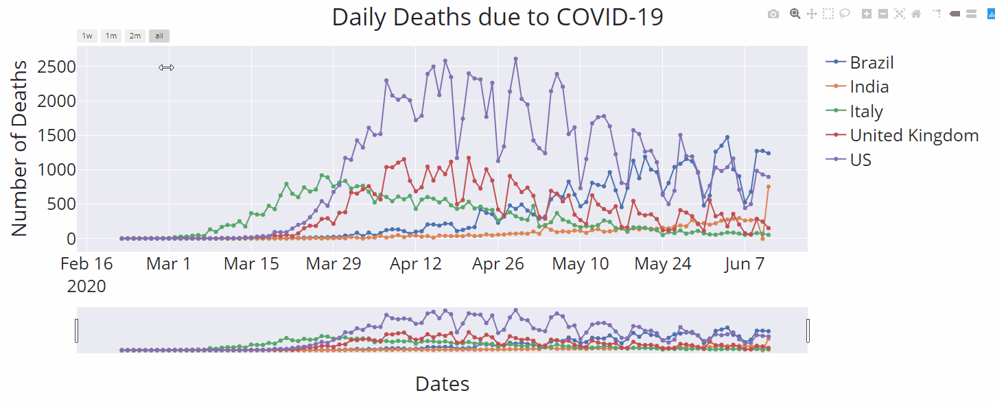
- fig.update_xaxes(
- rangeslider_visible=True,
- rangeselector=dict(
- buttons=list([
- dict(count=7, label="1w", step="day", stepmode="backward"),
- dict(count=1, label="1m", step="month", stepmode="backward"),
- dict(count=2, label="2m", step="month", stepmode="backward"),
- dict(step="all")
- ]),
- font = dict( color='#008000', size = 11),
- )
- )
3、自定義按鈕
在體驗了上面的范圍焦點功能后,我們可以很容易想象到如何構(gòu)建自定義按鈕。Plotly express 以一種簡單的方式滿足了這一需求。讓我們看看定制按鈕,把重點放在個別國家上。
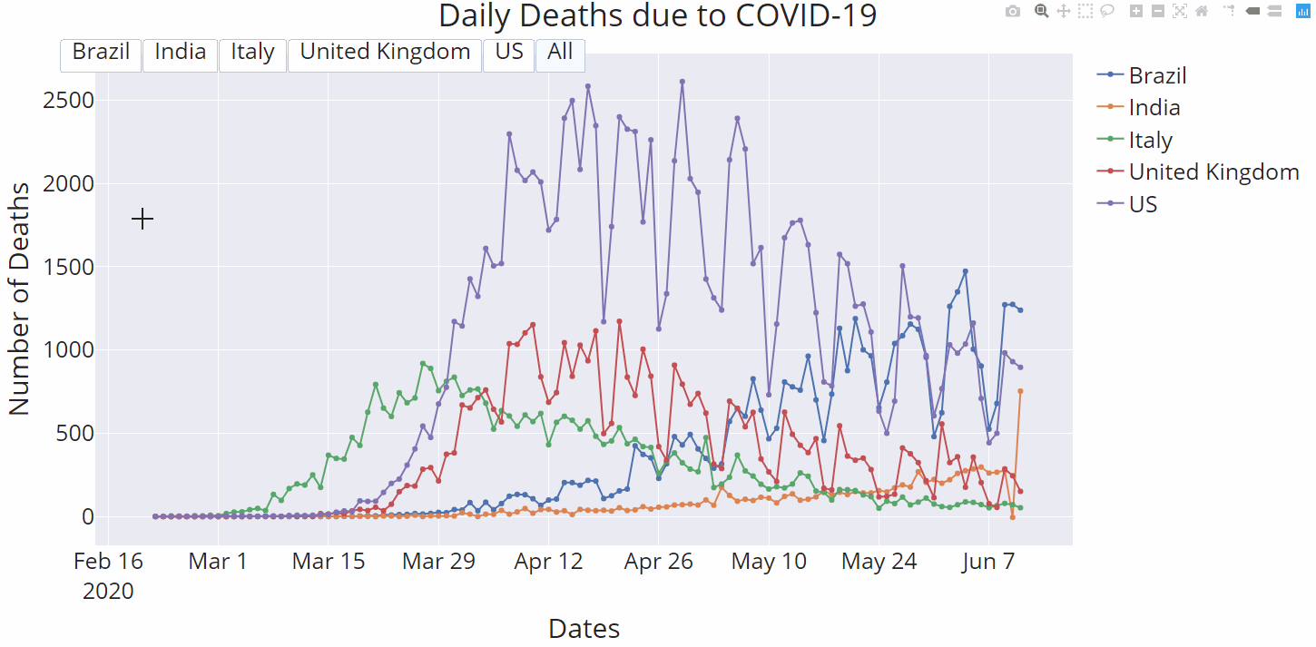
- fig.update_layout(
- updatemenus=[
- dict(
- type="buttons",
- direction="right",
- active=0,
- x=0.5,
- y=1.03,
- buttons=list([
- dict(label=df1.columns[0],
- method="update",
- args=[ {"visible": [True, False, False, False, False]},
- {'showlegend' : True}
- ]),
- dict(label=df1.columns[1],
- method="update",
- args=[ {"visible": [False, True, False, False, False]},
- {'showlegend' : True}
- ]),
- dict(label=df1.columns[2],
- method="update",
- args=[ {"visible": [False, False, True, False, False]},
- {'showlegend' : True}
- ]),
- dict(label=df1.columns[3],
- method="update",
- args=[ {"visible": [False, False, False, True, False]},
- {'showlegend' : True}
- ]),
- dict(label=df1.columns[4],
- method="update",
- args=[ {"visible": [False, False, False, False, True]},
- {'showlegend' : True}
- ]),
- dict(label='All',
- method="update",
- args=[ {"visible": [True, True, True, True, True]},
- {'showlegend' : True}
- ]),
- ]),
- )
- ]
- )
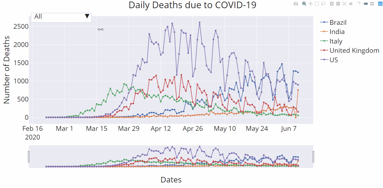
4、下拉式菜單
如果你想在可視化數(shù)據(jù)中,獲得一個下拉菜單,就像注釋掉一行代碼一樣簡單。在這里,你只需注釋掉“type=”buttons“就可以:
結(jié)論
Plotly express絕對是一個非常棒的數(shù)據(jù)可視化工具,它非常容易獲取,使用起來也非常像Python。在這篇文章里,我們只是簡單地描述了它所提供的功能。我鼓勵你進一步探索這個Python庫,因為它具有無限可能性!