Android 布局優化
布局原則
在Android UI布局過程中,通過遵守一些慣用、有效的布局原則,我們可以制作出高效且復用性高的UI,概括來說包括如下幾點:
盡量多使用RelativeLayout 和LinearLayout, 不要使用絕對布局AbsoluteLayout,在布局層次一樣的情況下, 建議使用LinearLayout代替RelativeLayout, 因為LinearLayout性能要稍高一點,但往往RelativeLayout可以簡單實現LinearLayout嵌套才能實現的布局。
將可復用的組件抽取出來并通過include標簽使用;
使用ViewStub標簽來加載一些不常用的布局;
使用merge標簽減少布局的嵌套層次;
RelativeLayout VS LinearLayout
***條原則說了布局層次一樣的情況下LinearLayout比RelativeLayout要好, 但往往RelativeLayout可以簡單實現LinearLayout嵌套才能實現的布局。假如需要實現如下布局:
![]()
用LinearLayout來實現xml代碼如下:
- <LinearLayout xmlns:android="http://schemas.android.com/apk/res/android"
- android:layout_width="fill_parent"
- android:layout_height="?android:attr/listPreferredItemHeight"
- android:padding="6dip">
- <ImageView
- android:id="@+id/icon"
- android:layout_width="wrap_content"
- android:layout_height="fill_parent"
- android:layout_marginRight="6dip"
- android:src="@drawable/icon" />
- <LinearLayout
- android:orientation="vertical"
- android:layout_width="0dip"
- android:layout_weight="1"
- android:layout_height="fill_parent">
- <TextView
- android:layout_width="fill_parent"
- android:layout_height="0dip"
- android:layout_weight="1"
- android:gravity="center_vertical"
- android:text="My Application" />
- <TextView
- android:layout_width="fill_parent"
- android:layout_height="0dip"
- android:layout_weight="1"
- android:singleLine="true"
- android:ellipsize="marquee"
- android:text="Simple application that shows how to use RelativeLayout" />
- </LinearLayout></LinearLayout>
而用RelativeLayout實現代碼如下:
- <RelativeLayout xmlns:android="http://schemas.android.com/apk/res/android"
- android:layout_width="fill_parent"
- android:layout_height="?android:attr/listPreferredItemHeight"
- android:padding="6dip">
- <ImageView
- android:id="@+id/icon"
- android:layout_width="wrap_content"
- android:layout_height="fill_parent"
- android:layout_alignParentTop="true"
- android:layout_alignParentBottom="true"
- android:layout_marginRight="6dip"
- android:src="@drawable/icon" />
- <TextView
- android:id="@+id/secondLine"
- android:layout_width="fill_parent"
- android:layout_height="26dip"
- android:layout_toRightOf="@id/icon"
- android:layout_alignParentBottom="true"
- android:layout_alignParentRight="true"
- android:singleLine="true"
- android:ellipsize="marquee"
- android:text="Simple application that shows how to use RelativeLayout" />
- <TextView
- android:layout_width="fill_parent"
- android:layout_height="wrap_content"
- android:layout_toRightOf="@id/icon"
- android:layout_alignParentRight="true"
- android:layout_alignParentTop="true"
- android:layout_above="@id/secondLine"
- android:layout_alignWithParentIfMissing="true"
- android:gravity="center_vertical"
- android:text="My Application" /></RelativeLayout>
可以看到用RelativeLayout實現,布局層次明顯少了,所以大多數時候優先推薦使用RelativeLayout。
查看布局層次
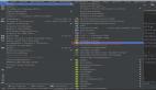
如何查看布局層次呢?有兩種辦法:一是通過手機的開 發者選項,4.0及以上Android版本可通過設置->開發者選項->顯示布局邊界打開頁面布局顯示,看看是否有不必要的節點和嵌套。第二 種就是利用SDK自帶的UI性能檢測工具HierarchyViewer。 進入sdk目錄下的tools文件夾下,找到HierarchyViewer并運行(此時保持你的模擬器或真機正在運行需要進行分析的App),雙擊我們 正在顯示的這個App所代表的進程。接下來便會進入hierarchyviewer的界面,我們可以在這里很清晰看到正在運行的UI的布局層次結構以及它 們之間的關系。大概的顯示如下圖:
![]()
通過布局圖我們可以看到根節點DecorView下 包含一個LinearLayout, 這個LinearLayout就是包含Activity布局和狀態欄的整個屏幕顯示的布局父節點,這個LinearLayout有兩個子節點, 一個是FrameLayout, FrameLayout就是Activity布局中默認的父布局節點, 這個節點下面就包含了我們自己寫的xml布局, 還有一個子節點就是ViewStub,關于這個節點我們在后面會詳細介紹。
< include />的使用
在實際開發中,我們經常會遇到一些共用的UI組件, 比如帶返回按鈕的導航欄,如果為每一個xml文件都設置這部分布局,一是重復的工作量大,二是如果有變更,那么每一個xml文件都得修改。還 好,Android為我們提供了include標簽,顧名思義,通過它,我們可以將這些共用的組件抽取出來單獨放到一個xml文件中,然后使用 include標簽導入共用布局,這樣,前面提到的兩個問題都解決了。下面以在一個布局main.xml中用include引入另一個布局 header.xml為例。
header.xml文件
- <?xml version="1.0" encoding="utf-8"?><RelativeLayout xmlns:android="http://schemas.android.com/apk/res/android"
- android:layout_width="match_parent"
- android:layout_height="match_parent" >
- <Button
- android:id="@+id/button"
- android:layout_width="match_parent"
- android:layout_height="@dimen/dp_40"
- android:layout_above="@+id/text"/>
- <TextView
- android:id="@+id/text"
- android:layout_width="match_parent"
- android:layout_height="@dimen/dp_40"
- android:layout_alignParentBottom="true"
- android:text="@string/app_name" /></RelativeLayout>
然后我們在需要引入footer的布局xml中通過include導入這個共用布局。
main.xml文件
- <FrameLayout xmlns:android="http://schemas.android.com/apk/res/android"
- android:layout_width="match_parent"
- android:layout_height="match_parent">
- <TextView
- android:layout_width="match_parent"
- android:layout_height="wrap_content"
- android:text="hello world" />
- <RelativeLayout
- android:layout_width="match_parent"
- android:layout_height="match_parent"
- android:layout_gravity="center" >
- <include layout="@layout/header" />
- </RelativeLayout></FrameLayout>
通過這種方式,我們既能提高UI的制作和復用效率,也能保證制作的UI布局更加規整和易維護。
< merge />的使用
merge標簽的作用是合并UI布局,使用該標簽能降低UI布局的嵌套層次。merge標簽可用于兩種典型情況:
-
布局根結點是FrameLayout且不需要設置background或padding等屬性,可以用merge代替,因為Activity內容布局的parent view就是個FrameLayout,所以可以用merge消除只剩一個,這一點可以從上圖中看到。
-
某布局作為子布局被其他布局include時,使用merge當作該布局的頂節點,這樣在被引入時頂結點會自動被忽略,而將其子節點全部合并到主布局中。
以***種情況為例,main.xml布局就可以優化如下:
- merge xmlns:android="http://schemas.android.com/apk/res/android"
- android:layout_width="match_parent"
- android:layout_height="match_parent">
- <FrameLayout
- android:layout_width="match_parent"
- android:layout_height="match_parent">
- <TextView
- android:layout_width="match_parent"
- android:layout_height="wrap_content"
- android:text="hello world" />
- <RelativeLayout
- android:layout_width="match_parent"
- android:layout_height="match_parent"
- android:layout_gravity="center" >
- <include layout="@layout/header" />
- </RelativeLayout>
- </FrameLayout></merge>
以第二種情況為例,header.xml布局可以優化如下:
- <?xml version="1.0" encoding="utf-8"?><merge xmlns:android="http://schemas.android.com/apk/res/android"
- android:layout_width="match_parent"
- android:layout_height="match_parent" >
- <Button
- android:id="@+id/button"
- android:layout_width="match_parent"
- android:layout_height="@dimen/dp_40"
- android:layout_above="@+id/text"/>
- <TextView
- android:id="@+id/text"
- android:layout_width="match_parent"
- android:layout_height="@dimen/dp_40"
- android:layout_alignParentBottom="true"
- android:text="@string/app_name" />
- </merge>
這樣就不會有多余的FrameLayout和RelativeLayout節點了。
ViewStub標簽
viewstub標簽同include標簽一樣可以 用來引入一個外部布局,不同的是,viewstub引入的布局默認不會擴張,即既不會占用顯示也不會占用位置,從而在解析layout時節省cpu和內 存。 viewstub常用來引入那些默認不會顯示,只在特殊情況下顯示的布局,如進度布局、網絡失敗顯示的刷新布局、信息出錯出現的提示布局等。
我們新建一個xml文件用來顯示一個網絡錯誤時提示信息error.xml:
- <RelativeLayout xmlns:android="http://schemas.android.com/apk/res/android"
- xmlns:tools="http://schemas.android.com/tools"
- android:layout_width="wrap_content"
- android:layout_height="wrap_content" >
- <TextView
- android:layout_width="wrap_content"
- android:layout_height="wrap_content"
- android:layout_centerInParent="true"
- android:background="@android:color/white"
- android:padding="10dip"
- android:text="Message"
- android:textColor="@android:color/black" /></RelativeLayout
然后在main.xml里面加入ViewStub的標簽引入上面的布局:
- <merge xmlns:android="http://schemas.android.com/apk/res/android"
- xmlns:tools="http://schemas.android.com/tools"
- android:layout_width="match_parent"
- android:background="@android:color/darker_gray"
- android:layout_height="match_parent" >
- ... <ViewStub
- android:id="@+id/error_layout"
- android:layout_width="wrap_content"
- android:layout_height="wrap_content"
- android:layout_gravity="center"
- android:layout="@layout/error" /></merge>
在java中通過(ViewStub)findViewById(id)找到ViewStub,通過stub.inflate()展開ViewStub,然后得到子View,如下:
- private View errorView;
- private void showError() {
- // not repeated infalte
- if (errorView != null) {
- errorView.setVisibility(View.VISIBLE);
- return;
- }
- ViewStub stub = (ViewStub)findViewById(R.id.error_layout);
- errorView = stub.inflate();}
- private void showContent() {
- if (errorView != null) {
- errorView.setVisibility(View.GONE);
- }}
在上面showError()中展開了ViewStub,同時我們對errorView進行了保存,這樣下次不用繼續inflate。
總結
這篇Blog沒有詳細介紹 HierarchyViewer工具的使用,相信如果對布局原則比較熟練之后,對工具的依賴大大減少,開發效率也會大大的提升。除這些布局原則之外,還需 要大家對Android各個組件的屬性很熟悉,比如如果要做這么一個布局, 一個圖片和一個文本的布局,新手們往往會用一個Layout嵌套ImageView和TextView來做, 但是當我們知道TextView有drawableLeft, drawableRight等屬性時,那么實現這樣的一個布局是非常快速高效的。總之,且學且實踐!