用 Python 繪制數(shù)據(jù)的7種流行的方法
“如何在 Python 中繪圖?”曾經(jīng)這個(gè)問(wèn)題有一個(gè)簡(jiǎn)單的答案:Matplotlib 是唯一的辦法。如今,Python 作為數(shù)據(jù)科學(xué)的語(yǔ)言,有著更多的選擇。你應(yīng)該用什么呢?
本指南將幫助你決定。
它將向你展示如何使用四個(gè)最流行的 Python 繪圖庫(kù):Matplotlib、Seaborn、Plotly 和 Bokeh,再加上兩個(gè)值得考慮的優(yōu)秀的后起之秀:Altair,擁有豐富的 API;Pygal,擁有漂亮的 SVG 輸出。我還會(huì)看看 Pandas 提供的非常方便的繪圖 API。
對(duì)于每一個(gè)庫(kù),我都包含了源代碼片段,以及一個(gè)使用 Anvil 的完整的基于 Web 的例子。Anvil 是我們的平臺(tái),除了 Python 之外,什么都不用做就可以構(gòu)建網(wǎng)絡(luò)應(yīng)用。讓我們一起來(lái)看看。
示例繪圖
每個(gè)庫(kù)都采取了稍微不同的方法來(lái)繪制數(shù)據(jù)。為了比較它們,我將用每個(gè)庫(kù)繪制同樣的圖,并給你展示源代碼。對(duì)于示例數(shù)據(jù),我選擇了這張 1966 年以來(lái)英國(guó)大選結(jié)果的分組柱狀圖。
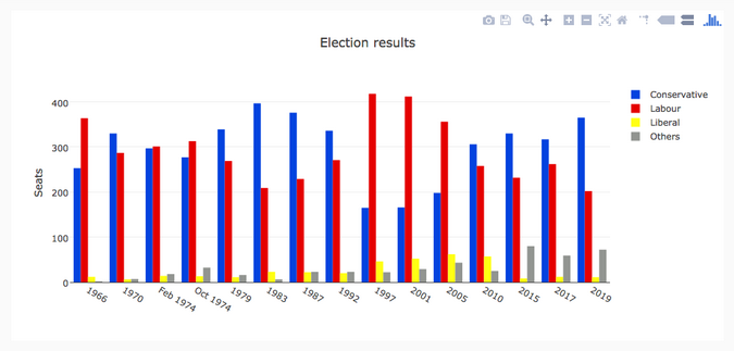
Bar chart of British election data我從維基百科上整理了英國(guó)選舉史的數(shù)據(jù)集:從 1966 年到 2019 年,保守黨、工黨和自由黨(廣義)在每次選舉中贏得的英國(guó)議會(huì)席位數(shù),加上“其他”贏得的席位數(shù)。你可以以 CSV 文件格式下載它。
Matplotlib
Matplotlib 是最古老的 Python 繪圖庫(kù),現(xiàn)在仍然是最流行的。它創(chuàng)建于 2003 年,是 SciPy Stack 的一部分,SciPy Stack 是一個(gè)類(lèi)似于 Matlab 的開(kāi)源科學(xué)計(jì)算庫(kù)。
Matplotlib 為你提供了對(duì)繪制的精確控制。例如,你可以在你的條形圖中定義每個(gè)條形圖的單獨(dú)的 X 位置。下面是繪制這個(gè)圖表的代碼(你可以在這里運(yùn)行):
- import matplotlib.pyplot as plt
- import numpy as np
- from votes import wide as df
- # Initialise a figure. subplots() with no args gives one plot.
- fig, ax = plt.subplots()
- # A little data preparation
- years = df['year']
- x = np.arange(len(years))
- # Plot each bar plot. Note: manually calculating the 'dodges' of the bars
- ax.bar(x - 3*width/2, df['conservative'], width, label='Conservative', color='#0343df')
- ax.bar(x - width/2, df['labour'], width, label='Labour', color='#e50000')
- ax.bar(x + width/2, df['liberal'], width, label='Liberal', color='#ffff14')
- ax.bar(x + 3*width/2, df['others'], width, label='Others', color='#929591')
- # Customise some display properties
- ax.set_ylabel('Seats')
- ax.set_title('UK election results')
- ax.set_xticks(x) # This ensures we have one tick per year, otherwise we get fewer
- ax.set_xticklabels(years.astype(str).values, rotation='vertical')
- ax.legend()
- # Ask Matplotlib to show the plot
- plt.show()
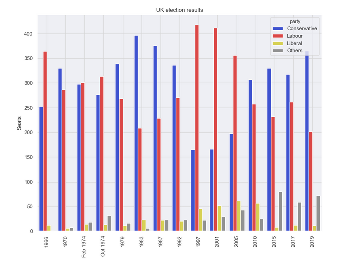
這是用 Matplotlib 繪制的選舉結(jié)果:
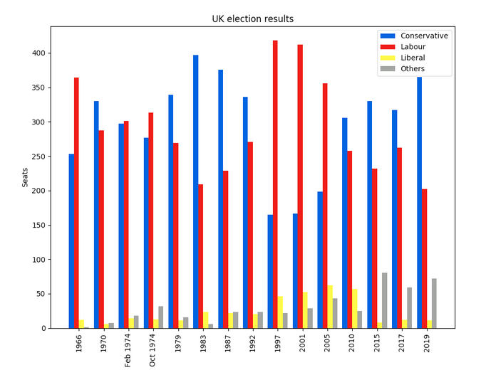
Matplotlib plot of British election data
Seaborn
Seaborn 是 Matplotlib 之上的一個(gè)抽象層;它提供了一個(gè)非常整潔的界面,讓你可以非常容易地制作出各種類(lèi)型的有用繪圖。
不過(guò),它并沒(méi)有在能力上有所妥協(xié)!Seaborn 提供了訪(fǎng)問(wèn)底層 Matplotlib 對(duì)象的逃生艙口,所以你仍然可以進(jìn)行完全控制。
Seaborn 的代碼比原始的 Matplotlib 更簡(jiǎn)單(可在此處運(yùn)行):
- import seaborn as sns
- from votes import long as df
- # Some boilerplate to initialise things
- sns.set()
- plt.figure()
- # This is where the actual plot gets made
- ax = sns.barplot(data=df, x="year", y="seats", hue="party", palette=['blue', 'red', 'yellow', 'grey'], saturation=0.6)
- # Customise some display properties
- ax.set_title('UK election results')
- ax.grid(color='#cccccc')
- ax.set_ylabel('Seats')
- ax.set_xlabel(None)
- ax.set_xticklabels(df["year"].unique().astype(str), rotation='vertical')
- # Ask Matplotlib to show it
- plt.show()
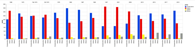
并生成這樣的圖表:
Seaborn plot of British election data
Plotly
Plotly 是一個(gè)繪圖生態(tài)系統(tǒng),它包括一個(gè) Python 繪圖庫(kù)。它有三個(gè)不同的接口:
- 一個(gè)面向?qū)ο蟮慕涌凇?/li>
- 一個(gè)命令式接口,允許你使用類(lèi)似 JSON 的數(shù)據(jù)結(jié)構(gòu)來(lái)指定你的繪圖。
- 類(lèi)似于 Seaborn 的高級(jí)接口,稱(chēng)為 Plotly Express。
Plotly 繪圖被設(shè)計(jì)成嵌入到 Web 應(yīng)用程序中。Plotly 的核心其實(shí)是一個(gè) JavaScript 庫(kù)!它使用 D3 和 stack.gl 來(lái)繪制圖表。
你可以通過(guò)向該 JavaScript 庫(kù)傳遞 JSON 來(lái)構(gòu)建其他語(yǔ)言的 Plotly 庫(kù)。官方的 Python 和 R 庫(kù)就是這樣做的。在 Anvil,我們將 Python Plotly API 移植到了 Web 瀏覽器中運(yùn)行。
這是使用 Plotly 的源代碼(你可以在這里運(yùn)行):
- import plotly.graph_objects as go
- from votes import wide as df
- # Get a convenient list of x-values
- years = df['year']
- x = list(range(len(years)))
- # Specify the plots
- bar_plots = [
- go.Bar(xx=x, y=df['conservative'], name='Conservative', marker=go.bar.Marker(color='#0343df')),
- go.Bar(xx=x, y=df['labour'], name='Labour', marker=go.bar.Marker(color='#e50000')),
- go.Bar(xx=x, y=df['liberal'], name='Liberal', marker=go.bar.Marker(color='#ffff14')),
- go.Bar(xx=x, y=df['others'], name='Others', marker=go.bar.Marker(color='#929591')),
- ]
- # Customise some display properties
- layout = go.Layout(
- title=go.layout.Title(text="Election results", x=0.5),
- yaxis_title="Seats",
- xaxis_tickmode="array",
- xaxis_tickvals=list(range(27)),
- xaxis_ticktext=tuple(df['year'].values),
- )
- # Make the multi-bar plot
- fig = go.Figure(data=bar_plots, layoutlayout=layout)
- # Tell Plotly to render it
- fig.show()
Bokeh
Bokeh(發(fā)音為 “BOE-kay”)擅長(zhǎng)構(gòu)建交互式繪圖,所以這個(gè)標(biāo)準(zhǔn)的例子并沒(méi)有將其展現(xiàn)其最好的一面。和 Plotly 一樣,Bokeh 的繪圖也是為了嵌入到 Web 應(yīng)用中,它以 HTML 文件的形式輸出繪圖。
下面是使用 Bokeh 的代碼(你可以在這里運(yùn)行):
- from bokeh.io import show, output_file
- from bokeh.models import ColumnDataSource, FactorRange, HoverTool
- from bokeh.plotting import figure
- from bokeh.transform import factor_cmap
- from votes import long as df
- # Specify a file to write the plot to
- output_file("elections.html")
- # Tuples of groups (year, party)
- x = [(str(r[1]['year']), r[1]['party']) for r in df.iterrows()]
- y = df['seats']
- # Bokeh wraps your data in its own objects to support interactivity
- source = ColumnDataSource(data=dict(xx=x, yy=y))
- # Create a colourmap
- cmap = {
- 'Conservative': '#0343df',
- 'Labour': '#e50000',
- 'Liberal': '#ffff14',
- 'Others': '#929591',
- }
- fill_color = factor_cmap('x', palette=list(cmap.values()), factors=list(cmap.keys()), start=1, end=2)
- # Make the plot
- p = figure(x_range=FactorRange(*x), width=1200, title="Election results")
- p.vbar(x='x', top='y', width=0.9, sourcesource=source, fill_colorfill_color=fill_color, line_color=fill_color)
- # Customise some display properties
- p.y_range.start = 0
- p.x_range.range_padding = 0.1
- p.yaxis.axis_label = 'Seats'
- p.xaxis.major_label_orientation = 1
- p.xgrid.grid_line_color = None
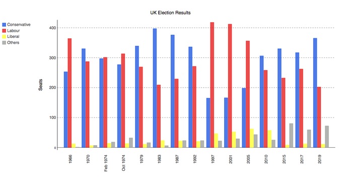
圖表如下:

Bokeh plot of British election data
Altair
Altair 是基于一種名為 Vega 的聲明式繪圖語(yǔ)言(或“可視化語(yǔ)法”)。這意味著它具有經(jīng)過(guò)深思熟慮的 API,可以很好地?cái)U(kuò)展復(fù)雜的繪圖,使你不至于在嵌套循環(huán)的地獄中迷失方向。
與 Bokeh 一樣,Altair 將其圖形輸出為 HTML 文件。這是代碼(你可以在這里運(yùn)行):
- import altair as alt
- from votes import long as df
- # Set up the colourmap
- cmap = {
- 'Conservative': '#0343df',
- 'Labour': '#e50000',
- 'Liberal': '#ffff14',
- 'Others': '#929591',
- }
- # Cast years to strings
- df['year'] = df['year'].astype(str)
- # Here's where we make the plot
- chart = alt.Chart(df).mark_bar().encode(
- x=alt.X('party', title=None),
- y='seats',
- column=alt.Column('year', sort=list(df['year']), title=None),
- color=alt.Color('party', scale=alt.Scale(domain=list(cmap.keys()), range=list(cmap.values())))
- )
- # Save it as an HTML file.
- chart.save('altair-elections.html')
結(jié)果圖表:
Altair plot of British election dataPygal
Pygal
專(zhuān)注于視覺(jué)外觀(guān)。它默認(rèn)生成 SVG 圖,所以你可以無(wú)限放大它們或打印出來(lái),而不會(huì)被像素化。Pygal 繪圖還內(nèi)置了一些很好的交互性功能,如果你想在 Web 應(yīng)用中嵌入繪圖,Pygal 是另一個(gè)被低估了的候選者。
代碼是這樣的(你可以在這里運(yùn)行它):
- import pygal
- from pygal.style import Style
- from votes import wide as df
- # Define the style
- custom_style = Style(
- colors=('#0343df', '#e50000', '#ffff14', '#929591')
- font_family='Roboto,Helvetica,Arial,sans-serif',
- background='transparent',
- label_font_size=14,
- )
- # Set up the bar plot, ready for data
- c = pygal.Bar(
- title="UK Election Results",
- style=custom_style,
- y_title='Seats',
- width=1200,
- x_label_rotation=270,
- )
- # Add four data sets to the bar plot
- c.add('Conservative', df['conservative'])
- c.add('Labour', df['labour'])
- c.add('Liberal', df['liberal'])
- c.add('Others', df['others'])
- # Define the X-labels
- c.x_labels = df['year']
- # Write this to an SVG file
- c.render_to_file('pygal.svg')
繪制結(jié)果:
Pygal plot of British election data
Pandas
Pandas 是 Python 的一個(gè)極其流行的數(shù)據(jù)科學(xué)庫(kù)。它允許你做各種可擴(kuò)展的數(shù)據(jù)處理,但它也有一個(gè)方便的繪圖 API。因?yàn)樗苯釉跀?shù)據(jù)幀上操作,所以 Pandas 的例子是本文中最簡(jiǎn)潔的代碼片段,甚至比 Seaborn 的代碼還要短!
Pandas API 是 Matplotlib 的一個(gè)封裝器,所以你也可以使用底層的 Matplotlib API 來(lái)對(duì)你的繪圖進(jìn)行精細(xì)的控制。
這是 Pandas 中的選舉結(jié)果圖表。代碼精美簡(jiǎn)潔!
- from matplotlib.colors import ListedColormap
- from votes import wide as df
- cmap = ListedColormap(['#0343df', '#e50000', '#ffff14', '#929591'])
- ax = df.plot.bar(x='year', colormap=cmap)
- ax.set_xlabel(None)
- ax.set_ylabel('Seats')
- ax.set_title('UK election results')
- plt.show()
繪圖結(jié)果:
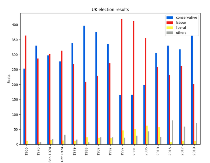
Pandas plot of British election data要運(yùn)行這個(gè)例子,請(qǐng)看這里。
以你的方式繪制
Python 提供了許多繪制數(shù)據(jù)的方法,無(wú)需太多的代碼。雖然你可以通過(guò)這些方法快速開(kāi)始創(chuàng)建你的繪圖,但它們確實(shí)需要一些本地配置。如果需要,Anvil 為 Python 開(kāi)發(fā)提供了精美的 Web 體驗(yàn)。祝你繪制愉快!