干貨 | 詳解支持向量機(附學習資源)
支持向量機(SVM)已經成為一種非常流行的算法。本文將嘗試解釋支持向量機的原理,并列舉幾個使用 Python Scikits 庫的例子。本文的所有代碼已經上傳 Github。有關使用 Scikits 和 Sklearn 的細節,我將在另一篇文章中詳細介紹。
什么是 支持向量機(SVM)?
SVM 是一種有監督的機器學習算法,可用于分類或回歸問題。它使用一種稱為核函數(kernel)的技術來變換數據,然后基于這種變換,算法找到預測可能的兩種分類之間的最佳邊界(optimal boundary)。簡單地說,它做了一些非常復雜的數據變換,然后根據定義的標簽找出區分數據的方法。
為什么這種算法很強大?
在上面我們說 SVM 能夠做分類和回歸。在這篇文章中,我將重點講述如何使用 SVM 進行分類。特別的是,本文的例子使用了非線性 SVM 或非線性核函數的 SVM。非線性 SVM 意味著算法計算的邊界不再是直線。它的優點是可以捕獲數據之間更復雜的關系,而無需人為地進行困難的數據轉換;缺點是訓練時間長得多,因為它的計算量更大。
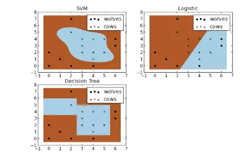
牛和狼的分類問題
什么是核函數技術?
核函數技術可以變換數據。它具備一些好用的分類器的特點,然后輸出一些你無需再進行識別的數據。它的工作方式有點像解開一條 DNA 鏈。從傳入數據向量開始,通過核函數,它解開并組合數據,直到形成更大且無法通過電子表格查看的數據集。該算法的神奇之處在于,在擴展數據集的過程中,能發現類與類之間更明顯的邊界,使得 SVM 算法能夠計算更為優化的超平面。
現在假裝你是一個農夫,那么你就有一個問題——需要建立一個籬笆,以保護你的牛不被狼攻擊。但是在哪里筑籬笆合適呢?如果你真的是一個用數據說話的農夫,一種方法是基于牛和狼在你的牧場的位置,建立一個分類器。通過對下圖中幾種不同類型的分類器進行比較,我們看到 SVM 能很好地區分牛群和狼群。我認為這些圖很好地說明了使用非線性分類器的好處,可以看到邏輯回歸和決策樹模型的分類邊界都是直線。
重現分析過程
想自己繪出這些圖嗎?你可以在你的終端或你選擇的 IDE 中運行代碼,在這里我建議使用 Rodeo(Python 數據科學專用 IDE 項目)。它有彈出制圖的功能,可以很方便地進行這種類型的分析。它也附帶了針對 Windows 操作系統的 Python 內核。此外,感謝 TakenPilot(一位編程者 https://github.com/TakenPilot)的辛勤工作,使得 Rodeo 現在運行閃電般快速。
下載 Rodeo 之后,從我的 github 頁面中下載 cows_and_wolves.txt 原始數據文件。并確保將你的工作目錄設置為保存文件的位置。
Rodeo 下載地址:https://www.yhat.com/products/rodeo
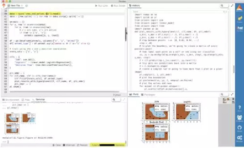
好了,現在只需將下面的代碼復制并粘貼到 Rodeo 中,然后運行每行代碼或整個腳本。不要忘了,你可以彈出繪圖選項卡、移動或調整它們的大小。
- # Data driven farmer goes to the Rodeoimport numpy as npimport pylab as plfrom sklearn import svmfrom sklearn import linear_modelfrom sklearn import treeimport pandas as pddef plot_results_with_hyperplane(clf, clf_name, df, plt_nmbr):
- x_min, x_max = df.x.min() - .5, df.x.max() + .5
- y_min, y_max = df.y.min() - .5, df.y.max() + .5
- # step between points. i.e. [0, 0.02, 0.04, ...]
- step = .02
- # to plot the boundary, we're going to create a matrix of every possible point
- # then label each point as a wolf or cow using our classifier
- xx, yy = np.meshgrid(np.arange(x_min, x_max, step), np.arange(y_min, y_max, step))
- Z = clf.predict(np.c_[xx.ravel(), yy.ravel()])
- # this gets our predictions back into a matrix
- Z = Z.reshape(xx.shape)
- # create a subplot (we're going to have more than 1 plot on a given image)
- pl.subplot(2, 2, plt_nmbr)
- # plot the boundaries
- pl.pcolormesh(xx, yy, Z, cmap=pl.cm.Paired)
- # plot the wolves and cows
- for animal in df.animal.unique():
- pl.scatter(df[df.animal==animal].x,
- df[df.animal==animal].y,
- marker=animal,
- label="cows" if animal=="x" else "wolves",
- color='black')
- pl.title(clf_name)
- pl.legend(loc="best")data = open("cows_and_wolves.txt").read()data = [row.split('\t') for row in data.strip().split('\n')]animals = []for y, row in enumerate(data):
- for x, item in enumerate(row):
- # x's are cows, o's are wolves
- if item in ['o', 'x']:
- animals.append([x, y, item])df = pd.DataFrame(animals, columns=["x", "y", "animal"])df['animal_type'] = df.animal.apply(lambda x: 0 if x=="x" else 1)# train using the x and y position coordiantestrain_cols = ["x", "y"]clfs = {
- "SVM": svm.SVC(),
- "Logistic" : linear_model.LogisticRegression(),
- "Decision Tree": tree.DecisionTreeClassifier(),}plt_nmbr = 1for clf_name, clf in clfs.iteritems():
- clf.fit(df[train_cols], df.animal_type)
- plot_results_with_hyperplane(clf, clf_name, df, plt_nmbr)
- plt_nmbr += 1pl.show()
SVM 解決難題
在因變量和自變量之間的關系是非線性的情況下,帶有核函數的 SVM 算法會得到更精確的結果。在這里,轉換變量(log(x),(x ^ 2))就變得不那么重要了,因為算法內在地包含了轉換變量的過程。如果你思考這個過程仍然有些不清楚,那么看看下面的例子能否讓你更清楚地理解。
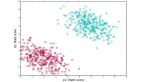
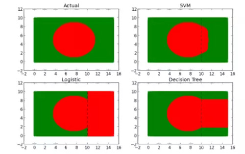
假設我們有一個由綠色和紅色點組成的數據集。當根據它們的坐標繪制散點圖時,點形成具有綠色輪廓的紅色圓形(看起來很像孟加拉國的旗子)。
如果我們丟失了 1/3 的數據,那么會發生什么?如果無法恢復這些數據,我們需要找到一種方法來估計丟失的 1/3 數據。
那么,我們如何弄清缺失的 1/3 數據看起來像什么?一種方法是使用我們所擁有的 80%數據作為訓練集來構建模型。但是使用什么模型呢?讓我們試試下面的模型:
- 邏輯回歸模型
- 決策樹
- 支持向量機
對每個模型進行訓練,然后用這些模型來預測丟失的 1/3 數據。下面是每個模型的預測結果:
模型算法比較的實現
下面是比較 logistic 模型、決策樹和 SVM 的代碼。
- import numpy as npimport pylab as plimport pandas as pdfrom sklearn import svmfrom sklearn import linear_modelfrom sklearn import treefrom sklearn.metrics import confusion_matrix
- x_min, x_max = 0, 15y_min, y_max = 0, 10step = .1# to plot the boundary, we're going to create a matrix of every possible point# then label each point as a wolf or cow using our classifierxx, yy = np.meshgrid(np.arange(x_min, x_max, step), np.arange(y_min, y_max, step))df = pd.DataFrame(data={'x': xx.ravel(), 'y': yy.ravel()})df['color_gauge'] = (df.x-7.5)**2 + (df.y-5)**2df['color'] = df.color_gauge.apply(lambda x: "red" if x <= 15 else "green")df['color_as_int'] = df.color.apply(lambda x: 0 if x=="red" else 1)print "Points on flag:"print df.groupby('color').size()printfigure = 1# plot a figure for the entire datasetfor color in df.color.unique():
- idx = df.color==color
- pl.subplot(2, 2, figure)
- pl.scatter(df[idx].x, df[idx].y, color=color)
- pl.title('Actual')train_idx = df.x < 10train = df[train_idx]test = df[-train_idx]print "Training Set Size: %d" % len(train)print "Test Set Size: %d" % len(test)# train using the x and y position coordiantescols = ["x", "y"]clfs = {
- "SVM": svm.SVC(degree=0.5),
- "Logistic" : linear_model.LogisticRegression(),
- "Decision Tree": tree.DecisionTreeClassifier()}# racehorse different classifiers and plot the resultsfor clf_name, clf in clfs.iteritems():
- figure += 1
- # train the classifier
- clf.fit(train[cols], train.color_as_int)
- # get the predicted values from the test set
- test['predicted_color_as_int'] = clf.predict(test[cols])
- test['pred_color'] = test.predicted_color_as_int.apply(lambda x: "red" if x==0 else "green")
- # create a new subplot on the plot
- pl.subplot(2, 2, figure)
- # plot each predicted color
- for color in test.pred_color.unique():
- # plot only rows where pred_color is equal to color
- idx = test.pred_color==color
- pl.scatter(test[idx].x, test[idx].y, color=color)
- # plot the training set as well
- for color in train.color.unique():
- idx = train.color==color
- pl.scatter(train[idx].x, train[idx].y, color=color)
- # add a dotted line to show the boundary between the training and test set
- # (everything to the right of the line is in the test set)
- #this plots a vertical line
- train_line_y = np.linspace(y_min, y_max) #evenly spaced array from 0 to 10
- train_line_x = np.repeat(10, len(train_line_y)) #repeat 10 (threshold for traininset) n times
- # add a black, dotted line to the subplot
- pl.plot(train_line_x, train_line_y, 'k--', color="black")
- pl.title(clf_name)
- print "Confusion Matrix for %s:" % clf_name print confusion_matrix(test.color, test.pred_color)pl.show()
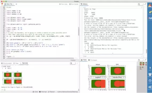
在 Rodeo 中復制和運行上面的代碼。
結果
從這些圖中可以清楚地看出 SVM 更好。為什么呢?如果觀察決策樹和 GLM(廣義線性模型,這里指 logistic 回歸)模型的預測形狀,你會看到預測給出的直邊界。因為它們的輸入模型沒有任何變換來解釋 x、y 以及顏色之間的非線性關系。給定一組特定的變換,我們絕對可以使 GLM 和 DT(決策樹)得出更好的結果,但尋找合適的變換將浪費大量時間。在沒有復雜的變換或特征縮放的情況下,SVM 算法 5000 數據點只錯誤地分類了 117 點(98%的精度,而 DT 精確度為 51%,GLM 精確度為 12%)。由于所有錯誤分類的點是紅色,所以預測的結果形狀有輕微的凸起。
不適用的場合
那為什么不是所有問題都使用 SVM?很遺憾,SVM 的魅力也是它最大的缺點。復雜數據變換以及得到的決策邊界平面是很難解釋的。這就是為什么它通常被稱為「黑箱」的原因。GLM 和決策樹恰恰相反,它們的算法實現過程及怎樣減少成本函數得到優良結果都很容易理解。
更多學習資源
想了解更多關于 SVM 的知識?以下是我收藏的一些好資源:
初級——SVM 教程:基礎教程,作者是 MIT 的 Zoya Gavrilov
鏈接地址:http://web.mit.edu/zoya/www/SVM.pdf
初級——SVM 算法原理:Youtube 視頻,作者是 Thales SehnKörting
鏈接地址:https://youtu.be/1NxnPkZM9bc
中級——支持向量機在生物醫學中的簡要介紹:紐約大學 & 范德堡大學提供的課件
鏈接地址:https://www.med.nyu.edu/chibi/sites/default/files/chibi/Final.pdf
高級——模式識別下的支持向量機教程:作者是貝爾實驗室(Bell Labs)的 Christopher Burges
鏈接地址:http://research.microsoft.com/en-us/um/people/cburges/papers/SVMTutorial.pdf
【本文是51CTO專欄機構機器之心的原創譯文,微信公眾號“機器之心( id: almosthuman2014)”】